Color-system engineering tool
OKLCH Palette Workbench
A dense OKLCH and Oklab palette workbench for building tokenized color systems, checking contrast, handling gamut limits, and exporting production-ready CSS.
OKLCH / Oklab
Workbench
Color systems
Not a picker. A workbench.
I built a production color tool for designers and developers who need palettes that look right, pass basic contrast expectations, handle gamut limits, and export into code people actually use.
Color tools are funny.
They usually start with a cute little picker, a few sliders, maybe some gradients, and before you know it you are manually nudging hex values like some medieval monk illuminating manuscripts in Figma.
Looks nice. But then the design system enters production and everything falls apart. The blue feels too loud at 500. The yellow disappears on white. The dark mode version is a crime scene. The brand color does not fit the generated scale. Accessibility starts knocking on the door.
So I built a proper OKLCH palette design workbench. Not a color picker. A workbench.
Token staircase
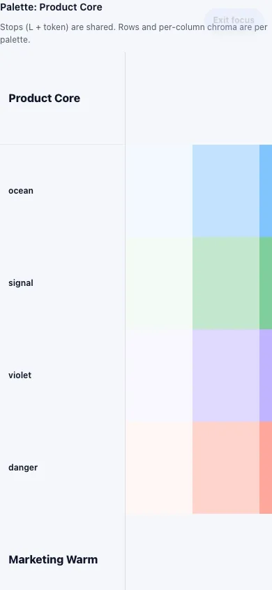
Rows become meaning. Columns become steps.
50
100
200
300
400
500
600
700
800
900
OKLCH gets closer to how color actually behaves to the eye.
The tool uses OKLCH and Oklab instead of doing the usual RGB or HSL dance. Humans do not experience color in neat little hex boxes, and two colors with the same HSL lightness can feel completely different.
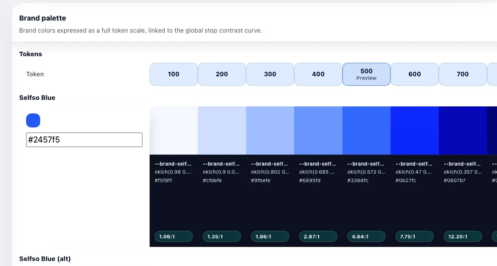
Rows become semantic colors. Columns become token steps. The whole thing maps to how design systems are actually used: primary-50, primary-100, primary-200, all the way down the little token staircase.
01
Vividness tuning
02
Cmax tuning
03
Contrast matching
04
Gamut handling
05
Brand derivation
06
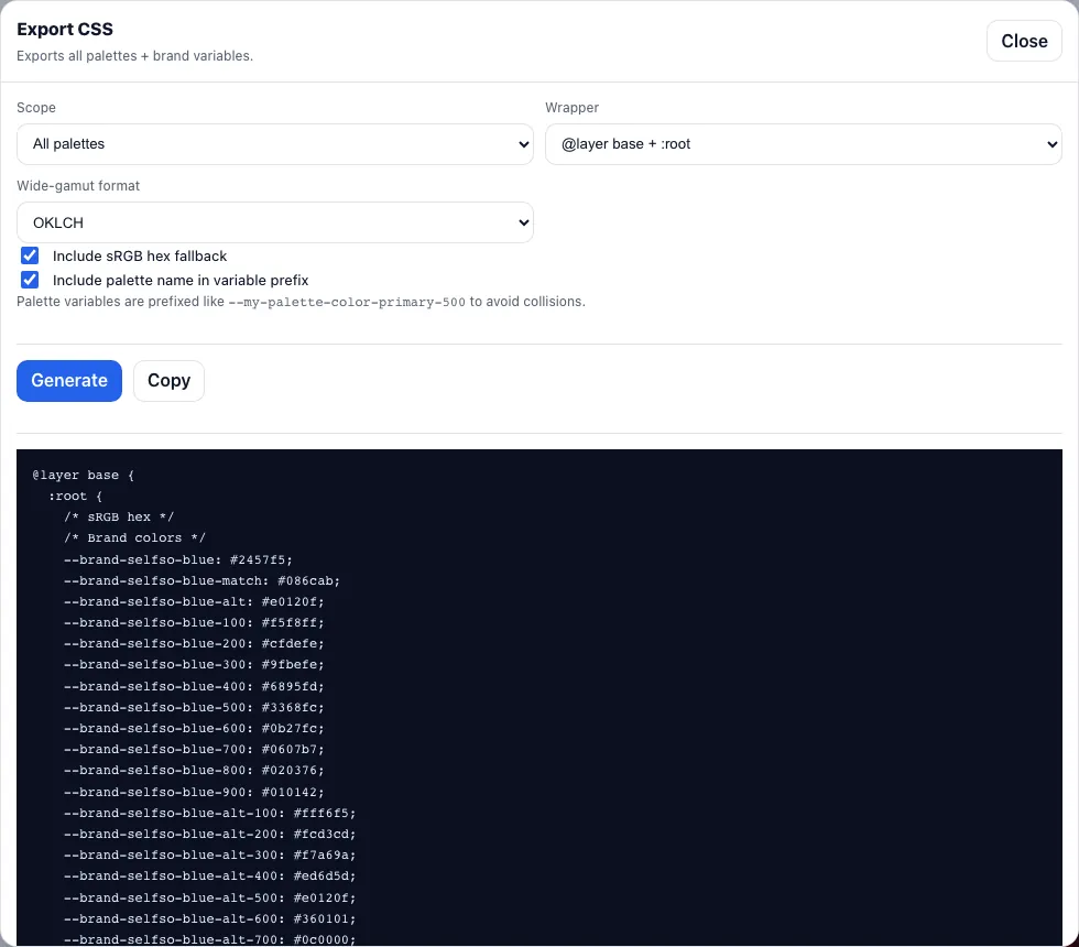
Wide-gamut export
The sweet spot is visual judgement with technical receipts.
The app can calculate max chroma per hue, lightness and target gamut, then show where a color hits the limits. It supports sRGB and Display P3, with strategies like chroma reduction, clipping, or wide-gamut export.
When a color changes, the tool can explain why. Not in a computer says no way. More like: this hue cannot be that vivid at this lightness in this gamut without leaving reality.
Screens
Dense because the work is dense.
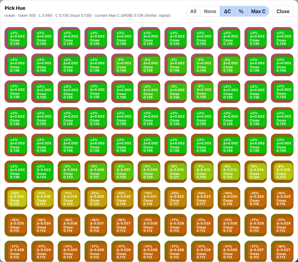
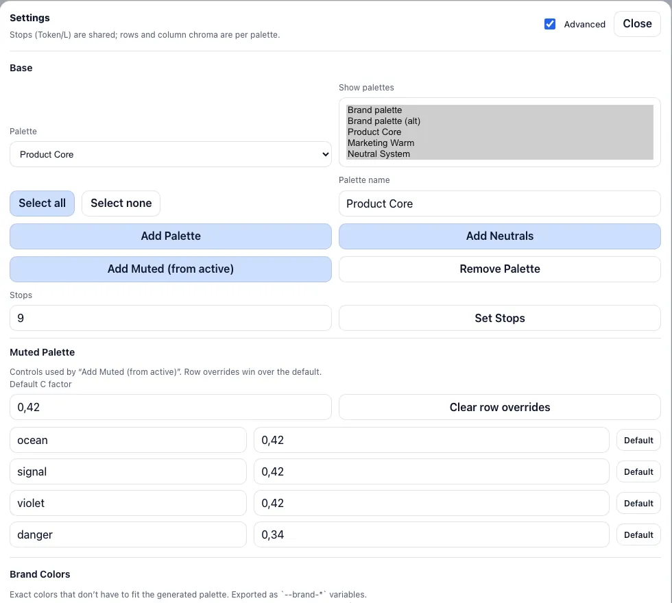
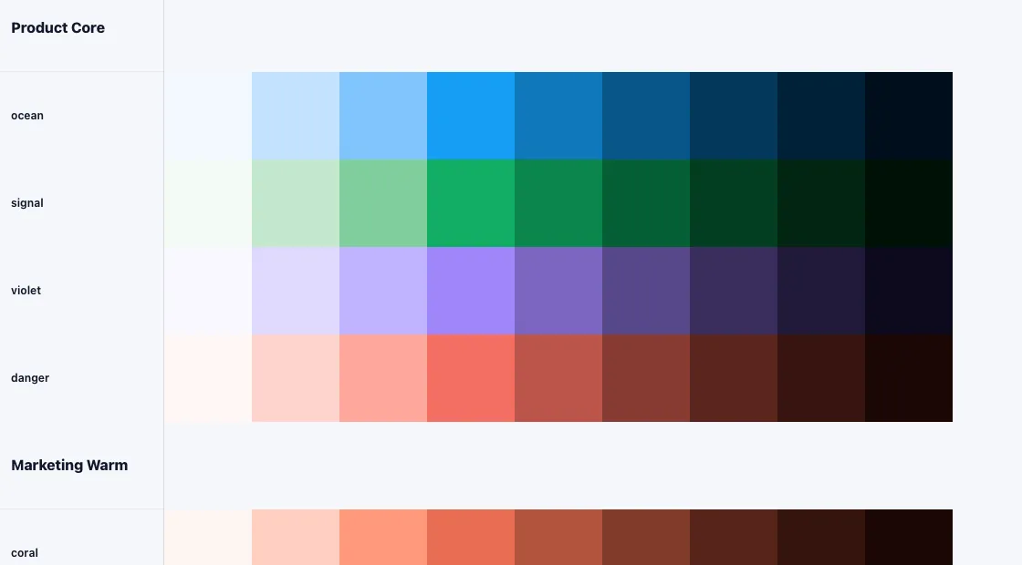
The user experience is dense because the work is dense.
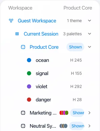
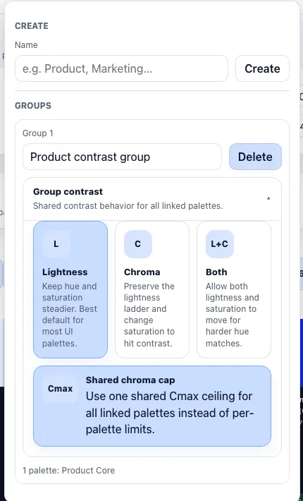
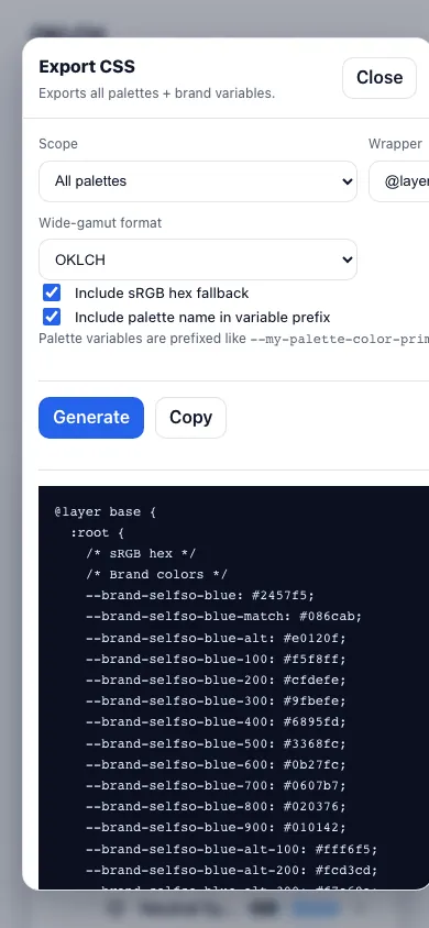
Persistent header actions, workspace hierarchy, sticky token controls, side navigation, export modals, debug views, focus mode, accounts, autosave, import/export and browser fallback. The kind of stuff that makes a tool feel less like a weekend experiment and more like something you could actually keep open while working.
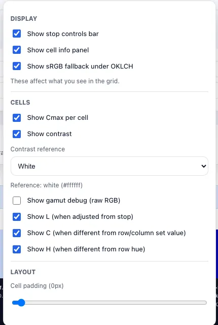
Each cell is both a color and a technical object: variable name, OKLCH value, fallback hex, contrast ratio and optional gamut or debug metadata. The palette is not just pretty. It is legible.
Persistence
Browser gods not invited.
Guest mode starts fast, but the system has enough database shape for real saved sessions, teams, themes and revision snapshots.
01
Users
02
Sessions
03
Teams
04
Themes
05
Palettes
06
Rows
07
Stops
08
Groups
Export
Taste to tokens.
Tailwind @theme
CSS variables
@layer base
OKLCH values
sRGB fallbacks
Display P3 output
Portable enough
Not just a giant desktop table.
A color-system engineering tool disguised as a visual playground.
Designers need to see and feel the palette. Developers need the output to be clean, predictable and usable. Accessibility needs contrast. Browsers need fallbacks. Brand colors need special treatment because brand colors are often emotional little divas that refuse to fit neatly into generated systems.
The app does not pretend everything can be solved with one perfect algorithm. It gives you controls, feedback, warnings, exports, and a place to think.
Make it feel fun. Make it export correctly. Make the weird color science do its thing quietly in the background.