Turn · interaction playground
Try more. Find the better interaction.
AI makes more alternatives practical. I build working versions, compare how they feel, and push the awkward cases—so we learn quickly and refine the details before committing.
From a card to a peek. By trying it.
A work item needs to be quick to scan. But the moment something matters, you want to see the whole thing without losing your place.
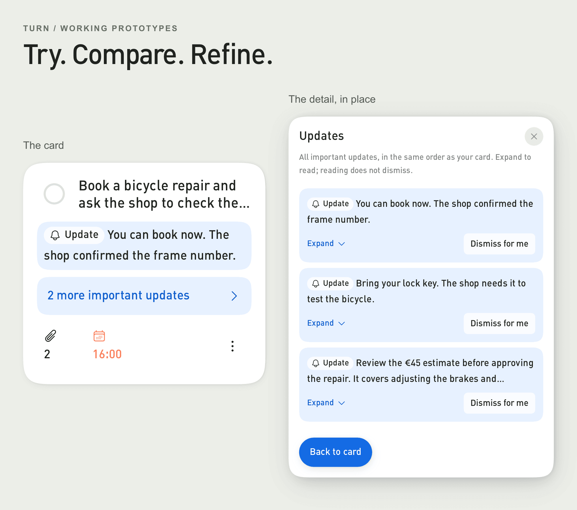
I started with a working card, then explored what happened when its details opened in a peek over the same interface. The question was how that felt: what stayed visible, what got crowded, and how naturally you could return.
Instead of choosing from static screens, I could switch versions, use them in context and push them into awkward situations while refining the solution.
The first version gives you something to question.
The earlier card gathers context into linked labels. It is compact, but you have to open those groups to find out what changed. Trying it raised the next question: could the important updates be visible, while their full detail stayed close by?
The peek gave me another working answer to compare. Then I could explore the rules together with the interface: which update leads, what happens when a date or link is missing, and what stays visible when the priorities change. Each situation is a working step you can question, adjust and try again.
Change the rules. See what happens.
Try the decisions behind the interface yourself. Start with Updates & order: open an update, then use the blue button to reach the ordering choices and see which update leads. Next, try Available facts to move priorities up or down and see what remains when information is missing. Each tab has a short guide; you can explore in any order.
AI makes this fast enough to do thoroughly. I can build alternatives, try combinations that would otherwise take too much time, and learn from things I did not expect. You get to explore the strengths and awkward parts of a real solution before it spreads across the product.