Turn · brand exploration
Finding Turn by making it move.
A working studio for shapes, letters, colour and motion. Exploring the identity where it would actually live.
What should Turn feel like?
You learn a lot more when you can actually play with an identity. Rotate the mark. Give it a different movement. Put it behind a sign-in form. See what still feels like the same thing.
So I built a working brand studio. With AI, making these experiments is fast enough to be part of the design process itself. A question becomes something we can try, compare and refine while the idea is still fresh.
The result is more than a logo: a set of working studies for shapes, motion, patterns, colour and the places where they meet the product.
Give the mark a character.
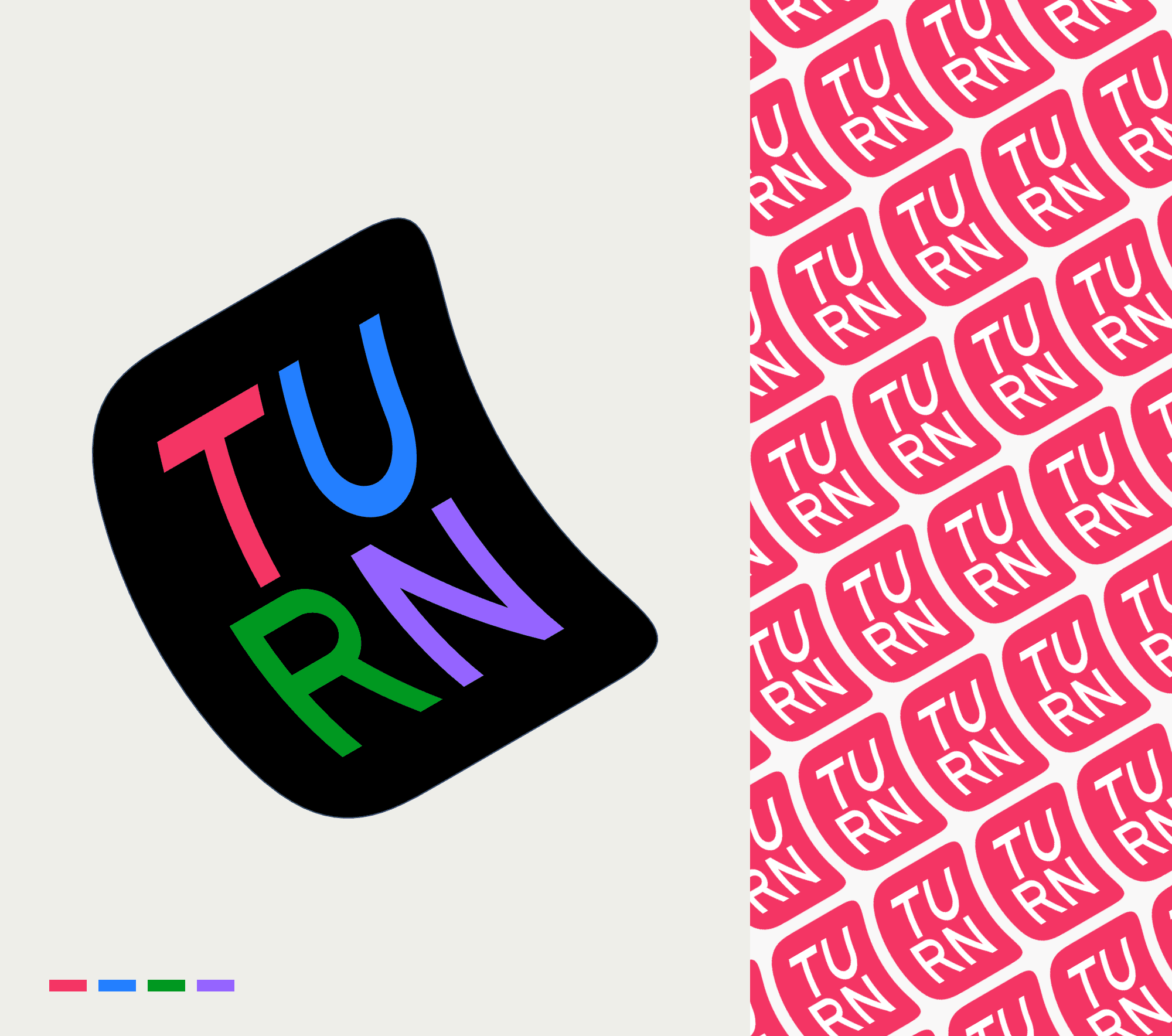
The folded shape is a real 3D model. I can change its pose, inspect it from another angle and build a movement from individual steps. A small hop and a full flip tell very different stories, even with the same artwork.
Rather than describe those possibilities, the studio lets us preview them beside each other, keep the promising ones and adjust the sequence. Timing, pauses and the way a movement ends become things we can feel and discuss.
Explore the working brand studio
Start with Static logo: drag the mark to inspect the fold. In Build a motion, preview Ollie and Kickflip and compare how they feel. Approve a favourite to keep it in your local list, or change the steps of your own sequence. Look & motion lets you play your selection. The remaining tabs put the identity into patterns, colour surfaces and product contexts. Open full screen for more room.
Find the rhythm, not just a repeat.
The same fold can become a regular grid, a connected diagonal, a wave or a stack with depth. Changing the spacing, tilt and colour rhythm can make it quieter, more energetic or harder to read.
Having those controls changes the conversation. We can follow an unexpected combination, compare it with the starting point and see where it works. The artwork stays vector throughout, so a useful result can be exported and built on.
Try the Turn pattern studio
Start with Regular grid, then try Continuous diagonal top edge, Overlapping wave and Depth stack. Compare the rhythm and how clearly you can still read the mark. Then change one thing: spacing, tilt or colour arrangement. The guides inside suggest what to try and notice. Reset whenever you like, or download your own pattern as an SVG.
See what happens around the product.
A movement can be lovely on its own and too much around something you need to use. The animation playground puts moving colour and shapes behind a working sign-in form, so we can judge the whole experience.
Fold mesh, Quiet mesh and Original circular offer different rhythms. Moving the animation behind or beside the form changes the balance again. These are working alternatives: you can change the colours, slow them down and try the form while they run.
Try motion in context
Begin with the login study. Switch Gradient treatment between Fold mesh, Quiet mesh and Original circular, keeping the same colours. Try Behind the form and Beside the form to compare attention and legibility. The form is a local preview. Further down, explore the avatar studies: change the person and starting pose, then compare the same identity at different sizes and among other people.
Keep the identity. Let it move.
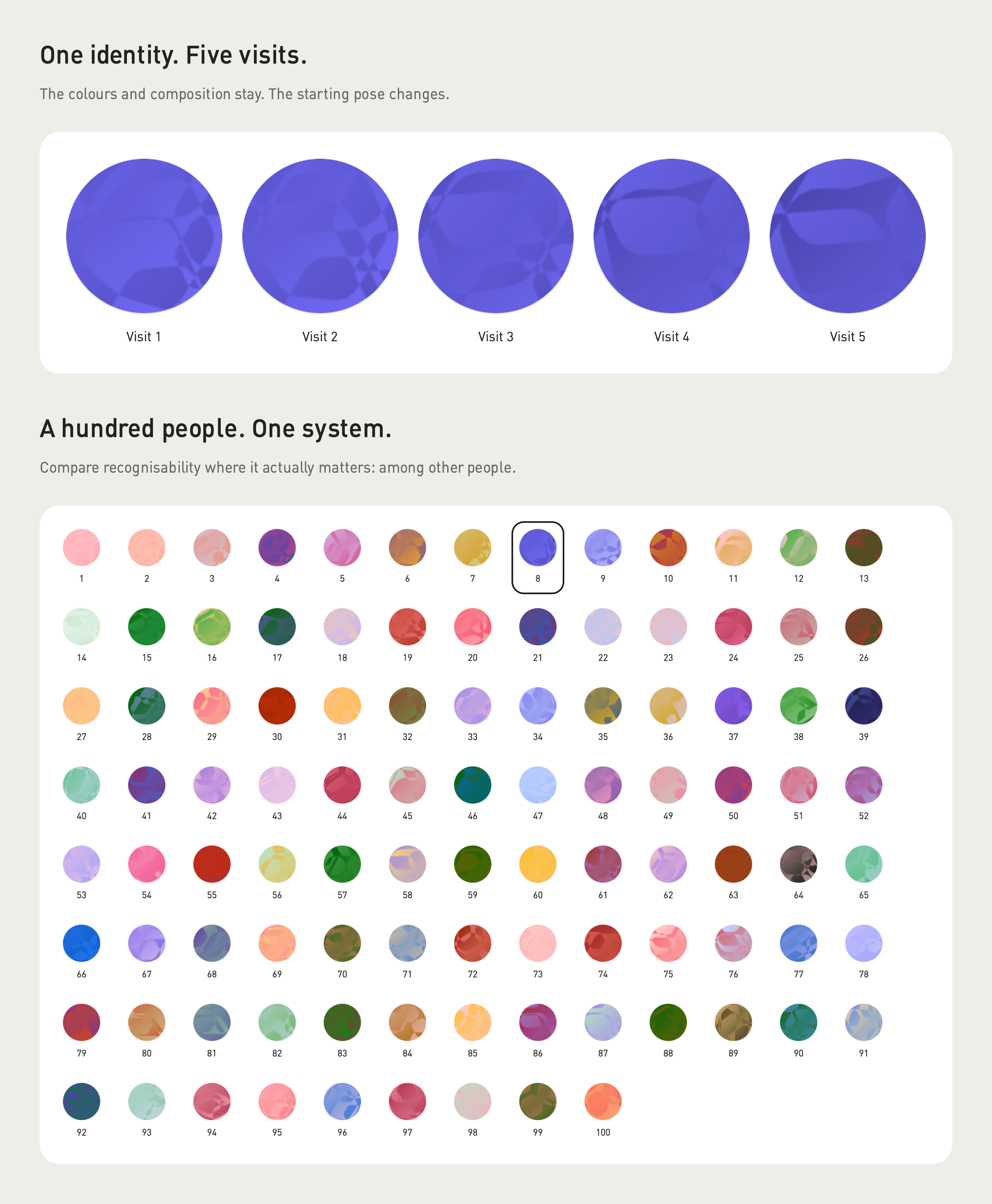
An avatar has a different job from a background: you need to recognise a person. These studies keep their colours and composition consistent while varying the starting pose between visits.
Five visits, a small avatar and a space with a hundred people make that question tangible. Does it still feel like the same person? Can you tell people apart? Exploring those cases is part of designing the system, not a detail to leave until later.
Know when to turn the volume down.
The expressive version also needs a quiet counterpart. The studio’s Logo hierarchy and Color surfaces tabs compare the mark in different roles, sizes and colour relationships.
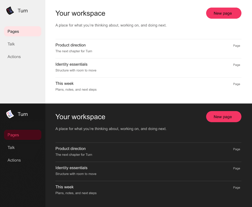
In these light and dark workspace studies, the identity sits alongside navigation and a single colour accent. Seeing both the bold and restrained versions helps us decide what belongs where.
More things to try. More to learn from.
Normally, building this many working alternatives would take too much time. AI makes it practical to explore them while designing: ask a better question, try another direction, notice something unexpected and refine it in the actual context.
That is what I bring to a project. Fast exploration, close attention to how things feel together, and working artwork and interactions we can keep building on.